Main menu

  • Home
  • Content
    • Current issue
    • Past issues
    • Healthy You
    • Job listings
    • Q&As
    • Special sections
  • Multimedia
    • Quiz
    • Podcast
    • Videos
  • FAQs
    • Advertising
    • Subscriptions
    • For APHA members
    • Internships
    • Change of address
  • About
    • About The Nation's Health
    • Submissions
    • Permissions
    • Purchase articles
    • Join APHA
  • Contact us
    • Feedback
  • APHA
    • AJPH
    • NPHW

User menu

  • My alerts

Search

  • Advanced search
The Nation's Health
  • APHA
    • AJPH
    • NPHW
  • My alerts
The Nation's Health

Advanced Search

  • Home
  • Content
    • Current issue
    • Past issues
    • Healthy You
    • Job listings
    • Q&As
    • Special sections
  • Multimedia
    • Quiz
    • Podcast
    • Videos
  • FAQs
    • Advertising
    • Subscriptions
    • For APHA members
    • Internships
    • Change of address
  • About
    • About The Nation's Health
    • Submissions
    • Permissions
    • Purchase articles
    • Join APHA
  • Contact us
    • Feedback
  • Follow The Nation's Health on Twitter
  • Follow APHA on Twitter
  • Visit APHA on Facebook
  • Follow APHA on Youtube
  • Follow APHA on Instagram
  • Follow The Nation's Health RSS feeds
NewsAPHA News

Popular infographics share new data on climate and health

Mary Stortstrom
The Nation's Health April 2024, 54 (2) 5;
Mary Stortstrom
  • Search for this author on this site
As temperatures around the world continue to rise from human-caused climate change, APHA and Climate Nexus have released updated versions of their popular infographics. The resources can be used to educate communities about the connection between climate and health.

As temperatures around the world continue to rise from human-caused climate change, APHA and Climate Nexus have released updated versions of their popular infographics. The resources can be used to educate communities about the connection between climate and health.

Courtesy APHA and Climate Nexus

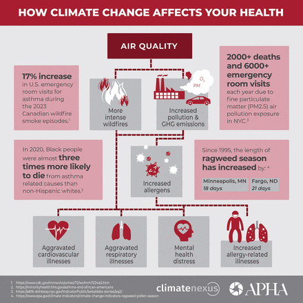
APHA’s popular infographic series that illustrates the public health effects of climate change has been updated with new science.

Created with Climate Nexus, the five infographics explain how poor air quality, extreme heat, extreme weather events and vector-borne diseases are on the rise as human activities change the Earth’s climate.

The updated infographics reference recent events and data, such as 2023 air pollution from Canadian wildfires, which caused a 17% increase in U.S. emergency room visits for people with asthma.

The infographic on rising temperatures notes that summer 2023 was the hottest recorded since 1880 and explains how extreme heat can aggravate cardiovascular and respiratory illnesses. Meanwhile, urban heat islands are forming, which can mean disadvantaged communities without tree canopies can be up to 20 degrees hotter than neighboring areas with more foliage and less pavement.

“These infographics will help us build a better understanding of the negative health outcomes associated with climate change,” Katherine Catalano, MS, director of APHA’s Center for Climate, Health and Equity, told The Nation’s Health. “These are real, tangible health effects that people are already feeling. Now is the time to spread awareness and take action.”

Another infographic focuses on how extreme weather expands the geographical range of vector-borne diseases. Since 1999, for instance, over 56,000 cases of West Nile virus have been recorded.

The infographics also share the socioeconomic impacts of climate change, from an increased need for mental health care services to billions in property damage from extreme weather events such as floods. An estimated $643 billion has been lost due to severe storms and floods since 1980, and extreme weather events are becoming more frequent as increased heat destabilizes the planet and its weather patterns.

For more information and to share the infographics, visit www.apha.org/climate-infographics.

  • Copyright The Nation’s Health, American Public Health Association

PreviousNext
Back to top

In this issue

The Nation's Health: 54 (2)
The Nation's Health
Vol. 54, Issue 2
April 2024
  • Table of Contents
  • Table of Contents (PDF)
  • Index by author
  • Complete Issue (PDF)

Healthy You

Healthy You

Print
Article Alerts
Sign In to Email Alerts with your Email Address
Email Article
We do not capture any email addresses.
Enter multiple addresses on separate lines or separate them with commas.
Popular infographics share new data on climate and health
(Your Name) has sent you a message from The Nation's Health
(Your Name) thought you would like to see this item on The Nation's Health website.
CAPTCHA
This question is for testing whether or not you are a human visitor and to prevent automated spam submissions.
Citation Tools
Popular infographics share new data on climate and health
Mary Stortstrom
The Nation's Health April 2024, 54 (2) 5;

Citation Manager Formats

  • BibTeX
  • Bookends
  • EasyBib
  • EndNote (tagged)
  • EndNote 8 (xml)
  • Medlars
  • Mendeley
  • Papers
  • RefWorks Tagged
  • Ref Manager
  • RIS
  • Zotero
Share
Popular infographics share new data on climate and health
Mary Stortstrom
The Nation's Health April 2024, 54 (2) 5;
del.icio.us logo Twitter logo Facebook logo Mendeley logo
Tweet Widget Facebook Like LinkedIn logo

Jump to section

  • Top

More in this TOC Section

  • Better messaging can advance health policies, experts share at 2026 Policy Action Institute
  • APHA in Brief
  • 2026 APHA election: Alleyne, Cariou run for APHA president
Show more APHA News

Popular features

  • Healthy You
  • Special sections
  • Q&As
  • Quiz
  • Podcasts

FAQs

  • Advertising
  • Subscriptions
  • For APHA members
  • Submissions
  • Change of address

APHA

  • Join APHA
  • Annual Meeting
  • NPHW
  • AJPH
  • Get Ready
  • Contact APHA
  • Privacy policy

© 2026 The Nation's Health

Powered by HighWire